About a week ago, Andy (who I still call Del out of habit) from Colt & the Coyotes asked me for some new art to promote their Summer 2024 gigs.
I can never say no to my pack, so I set to work, determined to create my first 100% hand-drawn pieces in years. No stock assets. Just me, my Crazy Plant Lady color palette in Procreate, and my own ideas.
I’ve had this image in my head of three coyotes for a long time now, and haven’t quite been able to execute it the way I wanted.

Finding a reference
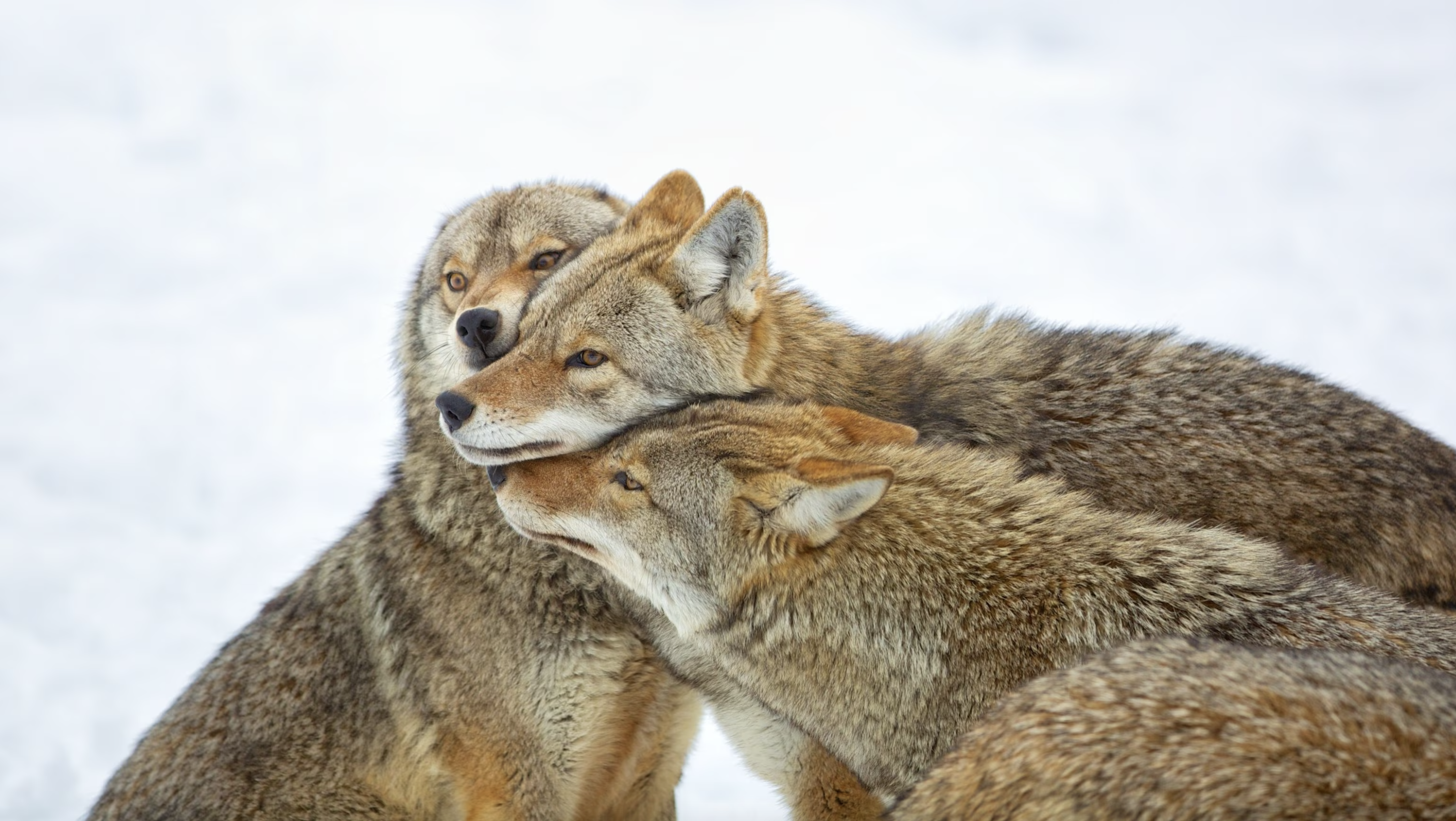
After a few unsuccessful attempts I realized that I did need some reference material. This year I want to move away from the kind of cartoony vibe I used last fall for Colt & the Coyotes. I found this adorable photo of three coyotes being affectionate in the wild. Well, kind of in the wild.
A lot of the nature photography you see is not actually animals in the wild but usually animals on protected land or in wildlife sanctuaries. These animals are more used to humans and often in much better health and condition than your average wild animal. It’s because of their frequent run-ins with humans.

PHOTO CREDIT: Paul McKenna Photography | Getty Images
The photo was taken by Perry McKenna and licensed by National Geographic Kids through Getty Images. I found it through a standard Google image search, and looked up McKenna and the license myself so that I could safely use it as a reference.
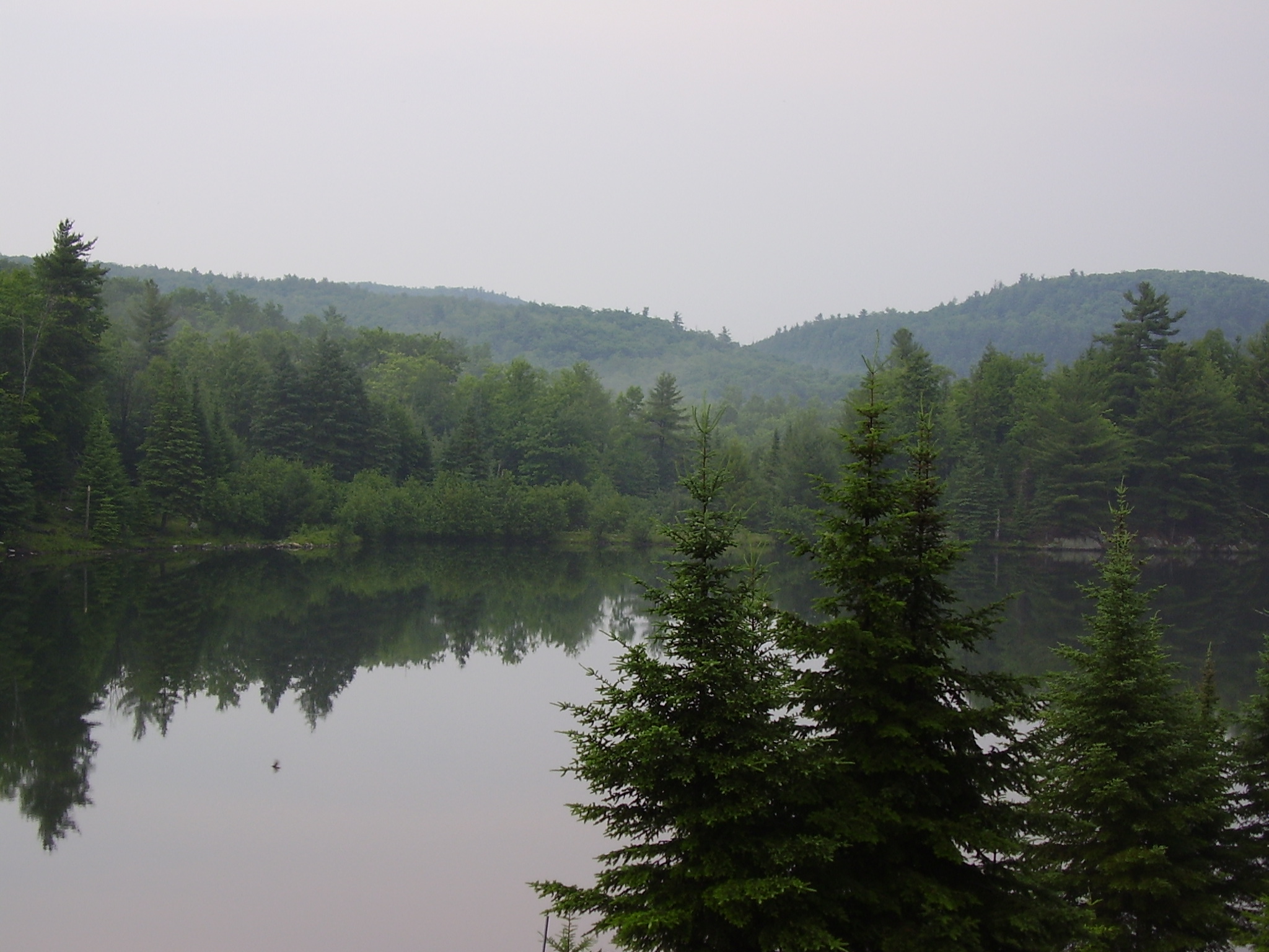
Looking the photo up also gave me some great background information, such as the fact that the photo was taken in Montebello, Quebec, Canada. Montebello is home to a number of wildlife parks. I don’t really imagine it would have been safe to take this photo from outside of a vehicle. I kind of suspect it was taken from a vehicle in one of the drive-thru parks – most likely Parc Omega.

PHOTO CREDIT: CC BY-SA 2.5
The photo comes from a series. While this particular shot looks sweet and affectionate, other photos of the same coyotes aren’t. They show that they had been recently baring teeth and arguing violently with one another. I guess about something that wild coyotes care about. So the photo really captured submission rather than affection.
Creating the flyer
Colt & the Coyotes have an incredible rapport on stage and genuine friendships that extend outside of their performances. So submission simply wouldn’t do as a vibe.
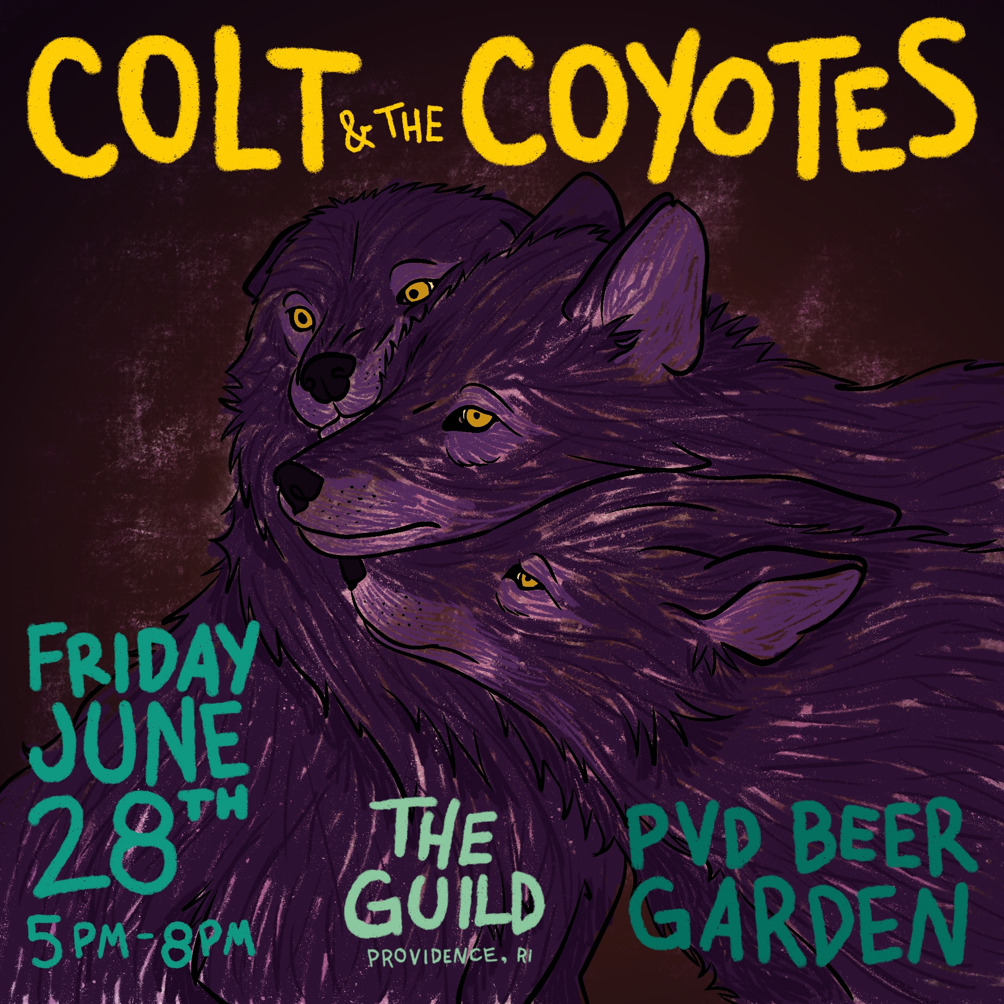
I wanted to amp up the appearance of affection to reflect the band’s friendship. Even a little bit of the hamminess and goofiness that Andy is known for on stage. I also took the coyotes out of a cold winter day and put them into a warm dusk.

While I didn’t use a stock asset in the finished product, I guess I did use a stock asset as a reference for the main composition. Nevertheless, I’m incredibly happy with the way this turned out – as well as the fact that I didn’t give up and try to squash together stock vectors of three boring coyote silhouettes.
I know there is some controversy about using photo references, but honestly, I don’t care. I had to get this done in under an hour with zero budget. I’m glad I used the reference instead of trying to draw coyotes from memory.
And I’m so glad I found a photo like this for my subjects. It looks far more natural than anything I could have imagined from the ether.
What do you think?

